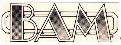
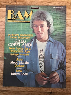
While I was a college student at UC Berkeley, I got a part-time job as a designer and paste-up artist at BAM magazine. BAM was a music magazine in the San Francisco Bay Area. It was kind of like the Rolling Stone of California.
They asked me to redesign their logo. Back then designing a logo meant using ink pens, T-squares, compasses, circle templates, photostats and waxers. The gradient tone was made with Zipatone, a pre-printed grid of black dots on a self-adhesive clear plastic sheet. I would stick it on the pen drawing and cut away everything outside of the design.
BAM used my Broadway-on-neon-style logo for a while, but it really was too complex for a magazine logo, so they adapted it to a simpler design.


3 comments:
I remember zipatone - awesome tool for the times
Yeah those were the days.☹️ Some of the studios I worked in had carpet on the floor as well which got covered in wax and spray glue so that your shoes stuck to the floor as you moved about..what nightmare! We used shelves and shelves of Letraset as well.
I used waxers, and a memory of photostats was, in 1988 when there was a drought in Northeast Ohio, stat after stat showed nothing because it was over 90 degrees in the studio I worked in : )
Post a Comment