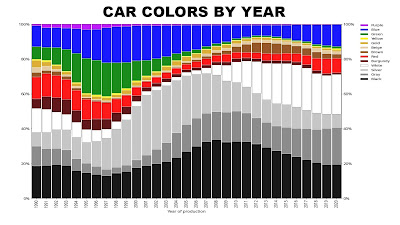
If you had the impression that cars were more colorful in the past, you'd be right. Thirty years ago, green was quite popular, but its popularity decreased, while white has increased rather dramatically.
In recent decades, consumer products and advertising have tended to head more in the direction of neutrality: white, gray, and black.
The objects we surround ourselves with are sometimes colorful and sometimes gray, white, or black. How have the colors of those objects changed over time?
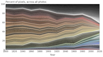
The chart below was created by sampling the distribution of pixels in samples of online museum collections of objects. The machine-learning algorithm also presumably also filtered out background colors.
The chart starts at the left with objects from 1800 and it finishes on the right in 2020. The range of warm colors has compressed in the last 20 years. But blue has increased in frequency.
At first I thought this was simply the result of objects yellowing with age, but there seem to be other factors at play as well. Before about 1900, most objects were made of wood, paper, brass, or other metals. When colorful plastics and printing became available, the gamut of colors widened.
--
Read more from Science Museum Lab via Paul Graham.


1 comment:
Very interesting, thank you.
Post a Comment